

The Problem
The valet management system was the company’s worst-performing product.
Users preferred paper and pen, claiming that the digital system was slow, confusing, and difficult to use.
Research & Discoveries
Together with the product manager, we conducted:
- Usability tests in the real work environment
- Interviews with end users
- Mapping of main friction points
Main discoveries:
- The flows did not reflect the real routine
- The interfaces caused doubts in simple steps
- The technology hindered more than it helped
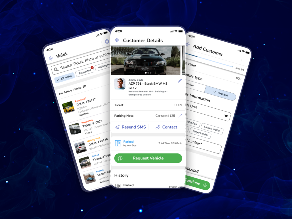
The Solution
I redesigned the system from scratch focusing on:
- Simplification of flows
- Clarity in actions: the next step always visible and intuitive
- Adaptation to work reality: fewer clicks, more agility
Each screen was validated with users and adjusted based on iterative tests.
Results
- Product became one of the top 3 best-selling in the company
- Average revenue per customer increased from R$2 to R$20 per day
- Number of customers requesting the solution tripled